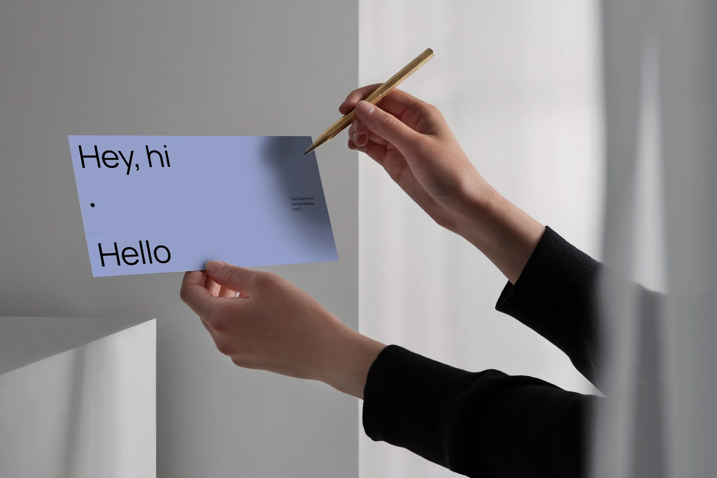
the future kind
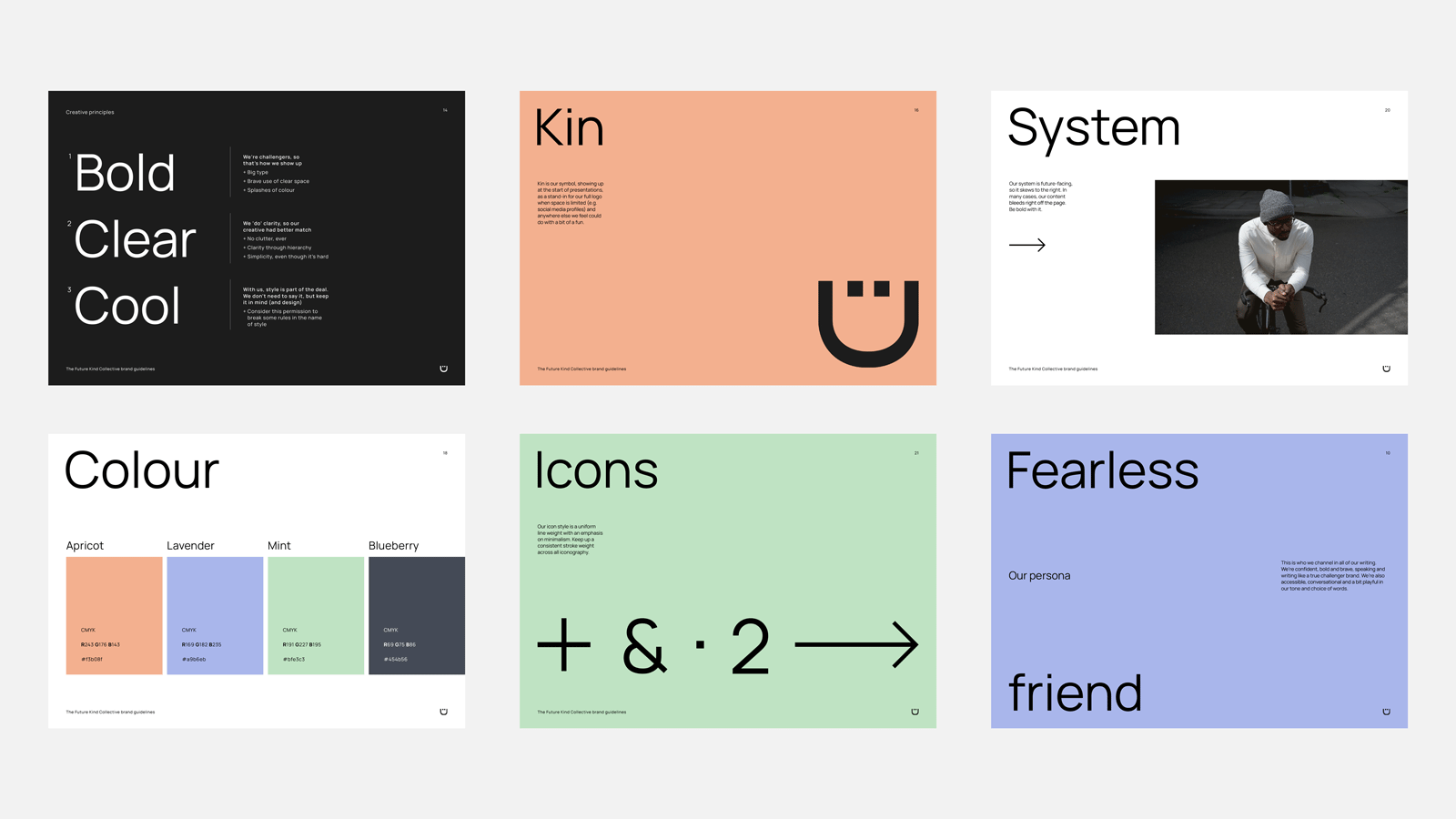
The Future Kind exists to create a world where all people get to work for kinder, fairer, better designed companies. They wanted a brand that reflects their purpose, and an identity with a meaning or intention behind every element. WATERSIGN worked with them to produce a tone of voice and visual identity that does just that, and brings to life the spirit of their proposition.


WATERSIGN developed a brand mark to be used as a shorthand for the logo where appropriate. This little pal is ‘Kin’, a word that can mean both family and friend. It’s also, of course, the letters that remain when Kin, who moonlights as a letter ‘D’, is taken from the word kind in the full logo.

in their words
Our brand is our pride and joy, and it consistently earns us accolades and praise (on a daily basis in fact)! WATERSIGN transformed our initial business concept into a distinctive identity that has propelled the recognition and growth of our business. As a result, we’ve forged crucial partnerships with industry leaders, secured coveted client projects even when competing with industry giants, and solidified our reputation in our sector.
This wouldn’t have been achievable without WATERSIGN’S remarkable blend of strategic thinking and creative brilliance, crafting a fully-fledged, universally recognised representation of our company that authentically mirrors who we are and what we stand for. WATERSIGN is the driving force behind our brand’s success, and we couldn’t be more grateful.
Alicia Grimes, Co-Founder